This post is also available in:
Think of your email signature as the final impression you leave in every email exchange, and its impact is often underestimated.
When a business email lacks a branded signature, it can create a negative impression. Despite this, many professionals neglect to update or optimize their email signatures, missing out on opportunities to reinforce their brand and build trust.
Let’s explore seven clear signs that indicate it’s time for an email signature redesign.
7 Signs it’s time to redesign your email signature
An outdated or ineffective email signature might seem harmless, but it’s quietly sending the wrong message every time you hit send. If you’re wondering whether it’s time to give your signature some attention, these seven signs are your clear green light for an email signature redesign.
Sign #1: Outdated contact information
If your email signature still shows your old phone number, a previous job title, or a personal email address you haven’t used in years, that’s a serious credibility risk.
Recipients who try to reach you and fail aren’t likely to try twice. And what does that say about your professional image? That your details aren’t worth keeping current?
This is more than a technical hiccup — it’s a trust issue.
Outdated contact details make you look out of touch and can damage brand identity if you’re representing a company name. Every email recipient should be able to glance at your signature and immediately know how to contact you, whether it’s by email, phone, or by clicking through to your website.
Worse, if you’re working across departments or in client-facing roles, outdated info can disrupt email signature management at scale.
Platforms like Bybrand make it easy to ensure everyone on the team keeps their email signature up to date using synced data.
Updating your signature regularly, especially when there’s a promotion, role change, or move, saves face and keeps your email communication professional.
Sign #2: Personal Gmail or Yahoo email in a business context
Using a free, personal email address like john.doe@gmail.com in professional communication raises eyebrows.
Example:
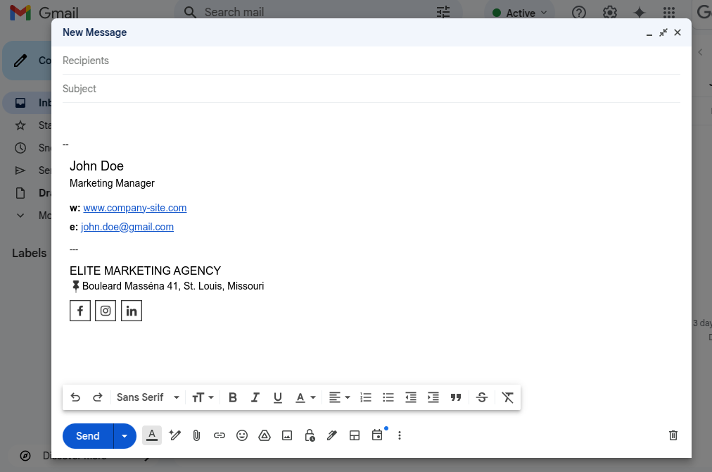
While it may be fine for side projects or freelancers, in most business contexts, it undercuts your authority. It signals a lack of structure or, worse, a lack of legitimacy.
A professional email account tied to your company name (like jane@acmeagency.com) not only looks sharper but also boosts brand recognition. It tells your recipient: “I represent a real company, and I take our communication seriously.”
For small businesses, especially, using a branded domain email is a subtle but important upgrade.
Paired with a clean, professional email signature, it reinforces your place in the business landscape. This gives prospects and clients more confidence in hitting reply.
Sign #3: Image-only signature
It’s tempting to design a sleek email signature as one image file. After all, it looks consistent, and you can drop in logos, contact details, and brand colors in one go.
Canva email signature templates:
But here’s the problem: not all email clients will render that image properly, especially on mobile devices or if images are disabled by default.
An image-based email signature can be invisible, inaccessible, and completely useless if the image doesn’t load.
Image-only signature in Gmail, with image blocked.
What’s worse, image-only signatures can inflate the file size of your email, trigger spam filters, and exclude any clickable links unless your recipient right-clicks and copies them — not exactly intuitive.
From an accessibility perspective, these also don’t offer alt text, making them unreadable for people using screen readers.
Instead, use a hybrid approach. An HTML code-based signature design allows you to combine graphic elements, social media icons, and your company logo with live text for contact details and links. This keeps your signature clean, modern, and functional across devices.
Read also: Canva email signature vs. HTML signature.
Sign #4: Signature with only name and title
On the opposite end of the spectrum, a signature that’s too minimalist is a missed opportunity. If your current sign-off is just your name and job title, you’re failing to give recipients any way to reach out, learn more about your brand, or take action.
Minimalism has its place, but stripping your signature section down to plain text removes your personality, your company’s visual identity, and any functional value.
Example:
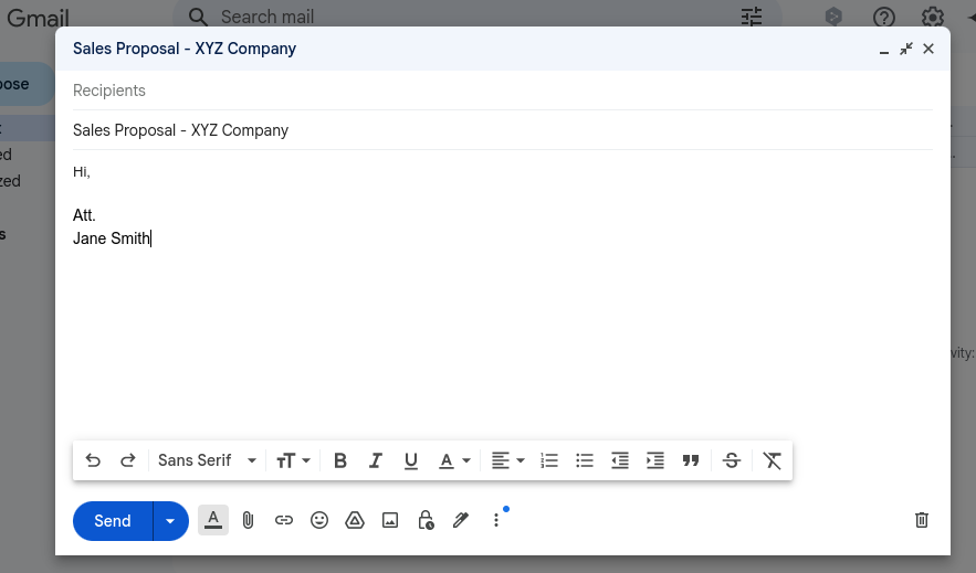
Think of it like handing out a business card with nothing but your name on it — pointless.
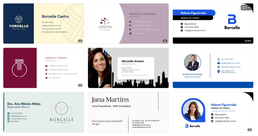
Modern email signature design is about balance. Add essential information like your direct line, website link, social media links, and physical or company address.
A smart CTA like “Schedule a demo” or “View portfolio” makes your email work harder without cluttering it.
If you’re unsure what to include, email signature templates from a platform like Bybrand or other email signature software can give you a head start with pre-tested layouts that follow email signature best practices.
Sign #5: Cluttered or overloaded signature design
Adding too many graphic elements, inspirational quotes, multiple social media icons, or multiple call-to-actions (CTAs) is the fastest way to create visual chaos.
A cluttered email signature makes your email footer unreadable, slows down loading on smaller screens, and creates a sloppy impression.
Remember: just because your signature editor lets you add images, banners, and buttons doesn’t mean you should include all of them. More content does not equal more value. In fact, too much information makes your message harder to digest.
Aim for a responsive design — one that works well across various screen sizes and loads quickly, even on a mobile phone or older mail app. Keep a clear hierarchy: company logo at the top, contact info next, and links or calls-to-action last.
Good email signature design should guide the eye, not confuse it.
Sign #6: No branding elements
If your signature doesn’t feature your company logo, brand colors, or a consistent font, you’re missing a huge opportunity for brand recognition.
Every email is a chance to subtly reinforce your company’s identity, whether the message is internal or external.
When a professional email signature lacks branding, it can feel disconnected from the rest of your company information, especially if your email is part of larger marketing campaigns, onboarding flows, or customer support replies.
A clear brand logo, even if it’s small, instantly connects your email message to your business. Using consistent typography, colors, and layout that align with your brand guidelines shows professionalism and thoughtfulness.

For teams, centralized email signature management tools can help enforce this consistency across departments. Whether someone works in sales or HR, the footer should still look like it came from the same company.
And don’t forget to customize your signature template for different roles while keeping the branding unified.
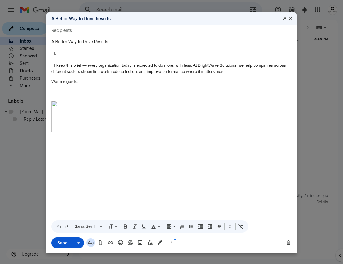
Sign #7: No call-to-action or social media links
If your email signature doesn’t encourage the recipient to do anything, it’s a wasted opportunity.
Modern signature design isn’t just about displaying your identity. It should help drive results.
Whether you want recipients to schedule a call, view your pricing page, read a blog post, or connect on LinkedIn, a call-to-action in your email footer is a simple, powerful upgrade.
Clickable social media icons make it easy for readers to explore your social media profiles and engage with your content beyond email. This strengthens relationships, boosts brand awareness, and makes your communication more human.
If you’re hesitant about adding links because of design concerns or email rendering, use email signature software, like Bybrand, that optimizes your email signature design for all email clients, from Apple Mail to Microsoft Outlook.
Just make sure the links are relevant, functional, and don’t look spammy. A single link that is visible and has a meaningful action is more effective than five crowded buttons that confuse the user.
Tips for a modern email signature redesign
Redesigning your email signature doesn’t have to be daunting. Using tools like Bybrand can simplify the process.
Vídeo:
The Bybrand email signature editor offers HTML templates that ensure consistency and flexibility across your organization’s email signatures. These templates allow you to incorporate essential elements like your company logo, contact information, and social media links seamlessly.
When redesigning your signature, focus on clarity and simplicity. Use a readable font, maintain a clean layout, and ensure that all links are functional.
Test your signature across different email clients and devices to ensure it displays correctly.
Regularly review and update your signature to keep it current and aligned with any changes in your role or company branding.
Conclusion
Your email signature is far more than a simple sign-off. It’s a powerful asset for professional communication, brand consistency, and audience engagement. When crafted thoughtfully, it reinforces your brand identity, strengthens trust with email recipients, and adds polish to every email message you send.
If you’ve identified any of the signs we covered, then it’s probably time for an email signature redesign. An ineffective or cluttered signature impacts how your brand is perceived and whether users take your call to action seriously.
Don’t let an outdated or underwhelming professional email signature weaken your professional image. Instead, take the time to refresh your email signature design. A modern signature can elevate your business emails, support your marketing campaigns, and leave a lasting impression.

Create your first email signature with Bybrand
Bybrand offers the ability to generate, administer, and distribute essential email signatures for your employees.