
This post is also available in:
This tutorial explains why, in some cases, email signature icons may become misaligned with text in Outlook. This occurs primarily in signatures that use icons alongside information such as phone, email, website, or address.
Unfortunately, this behavior is related to how the Outlook editor interprets and rewrites the signature’s HTML.
Example of an email signature with misaligned icons and text.
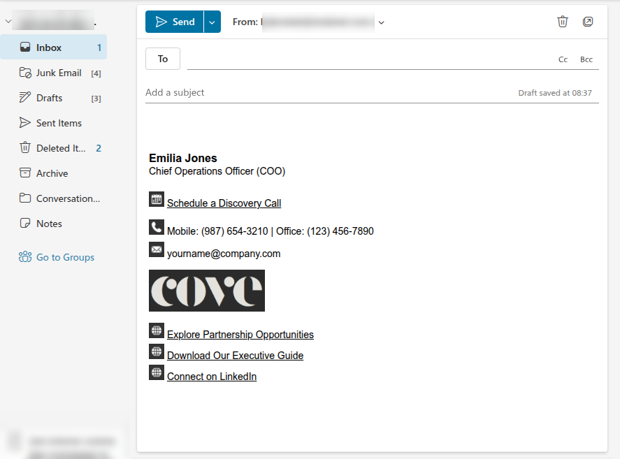
Note in the example that the text is vertically aligned at the bottom rather than the center.
Why does icon alignment change in Outlook?
Outlook may automatically change the signature’s HTML code when saving or loading the signature in the editor.
This means that even if the signature was correctly created in Bybrand, Outlook may remove important HTML tags or attributes used to maintain vertical alignment between icons and text.
For example, properties used to align an icon to the center of the text may be removed by Outlook. As a result, the icon may appear slightly above or below the text line.
Attempting to force vertical alignment
One possible attempt is to adjust the vertical alignment of the icons so that they are centered relative to the text.
In practice, this can be done by making adjustments to the signature’s HTML, such as vertical alignment in tables or images.
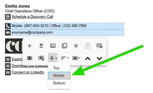
However, this solution does not work in 100% of cases because Outlook may remove this parameter when loading or saving the signature.
Example video:
Recommended alternatives
Replacing icons with text
If the misalignment persists, we recommend a more stable alternative: replacing icons with plain text.
Instead of using an icon to identify phone, email, website, or address, you can use words such as:
- Phone:
- Email:
- Website:
- Address:
Example: email signature without icons using text for Outlook.
This option is simpler, more compatible with Outlook, and reduces the risk of visual issues in the signature.
Changing the icon size
If the icons are too large, the misalignment may become more evident.
A simple alternative is to reduce the icon dimensions to between 20px and 25px. Smaller icons tend to minimize the perception of misalignment and give the signature a more balanced appearance.
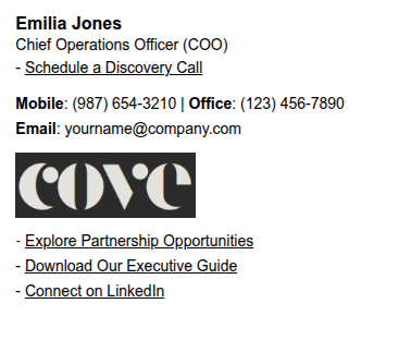
Using a hyphen
Another option is to remove the icons and leave only a hyphen before the information.
Example:
- Explore Partnership Opportunities
- Download Our Executive Guide
- Connect on LinkedIn
This alternative keeps the signature clean and easy to understand without relying on images or complex visual alignment.
In most cases, the information is already self-explanatory, especially when the email, phone, or website follows a known format.
Related articles
You can also consult these tutorials: